更新了四个组件,分别是 菜单 选择器 加载 和输入框
自定义UI组件库
这是一套基于Web Components实现的现代化UI组件库,具有响应式设计、多主题支持以及性能优化模式。组件采用原生JavaScript实现,无需额外依赖,可以轻松集成到任何Web项目中。
核心特性
- 原生支持 – 基于Web Components标准,无框架依赖
- 双主题模式 – 支持亮色和暗色两种主题
- 双性能模式 – 提供模糊特效模式和高性能模式
- 响应式设计 – 适配不同设备尺寸
- 可访问性 – 遵循ARIA标准,支持键盘导航
- 自定义样式 – 通过CSS自定义属性轻松定制
组件列表
当前提供的组件包括:
- Custom Button – 可定制的按钮组件
- Custom Card – 卡片容器组件
- Custom Switch – 开关切换组件
- Custom Notification – 通知提示组件
- Custom Loader – 加载动画组件
- Custom Select – 下拉选择组件
- Custom Menu – 菜单组件
- Custom Input – 输入框组件
安装与使用
基本集成
将组件脚本引入到您的HTML文件中:
<script src="path/to/custom-button.js"></script>
<script src="path/to/custom-card.js"></script>
<script src="path/to/custom-switch.js"></script>
<script src="path/to/custom-notification.js"></script>
<script src="path/to/custom-loader.js"></script>
<script src="path/to/custom-select.js"></script>
<script src="path/to/custom-menu.js"></script>
<script src="path/to/custom-input.js"></script>
组件使用示例
Custom Button 按钮组件
<custom-button
  text="点击我"
  theme="light"
  variant="blur">
</custom-button>
Custom Card 卡片组件
<custom-card
  title="卡片标题"
  theme="light"
  variant="blur">
  <div>卡片内容放这里</div>
</custom-card>
Custom Switch 开关组件
<custom-switch
  label="开启功能"
  theme="light"
  variant="blur">
</custom-switch>
Custom Notification 通知组件
通知组件通常通过JavaScript动态创建:
// 显示一个通知
CustomNotification.show({
  message: "这是一条通知消息",
  type: "info", // info, success, warning, error
  theme: "light",
  variant: "blur",
  duration: 3000 // 显示时长,毫秒
});
Custom Loader 加载组件
<custom-loader
type="spinner"
size="medium"
theme="light"
variant="blur"
label="加载中...">
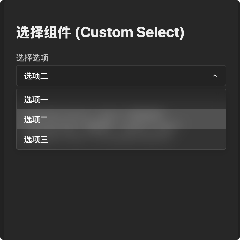
</custom-loader>Custom Select 下拉选择组件
<custom-select
label="选择选项"
placeholder="请选择"
theme="light"
variant="blur"
options='[{"value":"option1","text":"选项1"},{"value":"option2","text":"选项2"}]'>
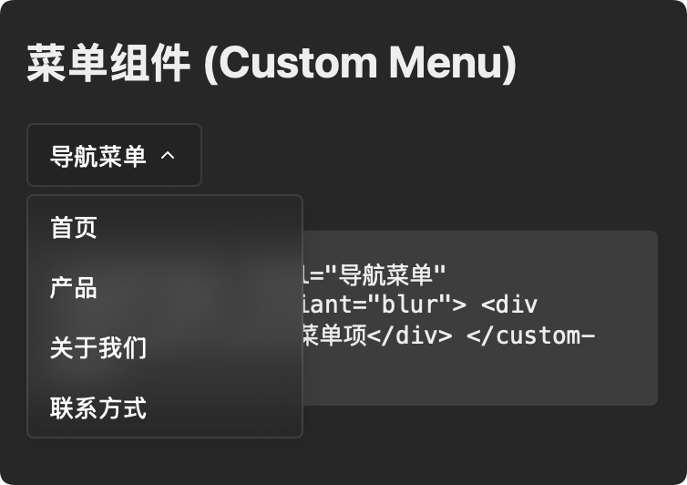
</custom-select>Custom Menu 菜单组件
<custom-menu
  theme="light"
  variant="blur">
  <div slot="menu-item">菜单项 1</div>
  <div slot="menu-item">菜单项 2</div>
  <div slot="menu-item">菜单项 3</div>
</custom-menu>
Custom Input 输入框组件
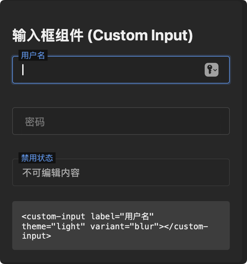
<custom-input
  label="用户名"
  theme="light"
  variant="blur"
  type="text"
  placeholder="请输入用户名">
</custom-input>
详细API文档
Custom Button 按钮组件
按钮组件提供用户交互的基本元素。
属性
| 属性名 | 类型 | 默认值 | 说明 |
|---|---|---|---|
| text | String | “Button” | 按钮显示的文本 |
| disabled | Boolean | false | 是否禁用按钮 |
| theme | String | “light” | 主题,可选值: “light”、”dark” |
| variant | String | “blur” | 显示模式,可选值: “blur”(模糊效果)、”performance”(高性能) |
事件
- click: 当按钮被点击时触发(如果未禁用)
示例代码
// 创建并配置按钮
const button = document.createElement('custom-button');
button.text = "提交表单";
button.addEventListener('click', () => {
  console.log('按钮被点击');
});

// 禁用按钮
button.disabled = true;

// 切换主题和变体
button.theme = "dark";
button.variant = "performance";
Custom Card 卡片组件
卡片组件用于内容分组和展示。
属性
| 属性名 | 类型 | 默认值 | 说明 |
|---|---|---|---|
| title | String | “卡片标题” | 卡片标题文本 |
| theme | String | “light” | 主题,可选值: “light”、”dark” |
| variant | String | “blur” | 显示模式,可选值: “blur”、”performance” |
插槽
- 默认插槽: 放置卡片内容
示例代码
// HTML中使用
document.body.innerHTML += `
  <custom-card title="数据统计" theme="dark" variant="blur">
    <div>这里是卡片内容</div>
  </custom-card>
`;

// 或通过JavaScript创建
const card = document.createElement('custom-card');
card.title = "用户信息";
card.appendChild(document.createElement('div')).textContent = "内容区域";
document.body.appendChild(card);
Custom Switch 开关组件
开关组件用于切换状态。
属性
| 属性名 | 类型 | 默认值 | 说明 |
|---|---|---|---|
| checked | Boolean | false | 是否选中/开启 |
| label | String | “开关” | 开关标签文本 |
| disabled | Boolean | false | 是否禁用 |
| theme | String | “light” | 主题,可选值: “light”、”dark” |
| variant | String | “blur” | 显示模式,可选值: “blur”、”performance” |
事件
- change: 当开关状态改变时触发,事件详情包含
checked属性
示例代码
const switchElement = document.createElement('custom-switch');
switchElement.label = "启用通知";
switchElement.checked = true;

switchElement.addEventListener('change', (event) => {
  console.log(`开关状态: ${event.detail.checked ? '开启' : '关闭'}`);
});

// 监听状态变化
switchElement.addEventListener('change', (event) => {
  if (event.detail.checked) {
    console.log('功能已启用');
  } else {
    console.log('功能已禁用');
  }
});
Custom Notification 通知组件
通知组件用于显示消息提示。
静态方法
CustomNotification.show(options)
显示一个通知,options 参数包含:
| 参数名 | 类型 | 默认值 | 说明 |
|---|---|---|---|
| message | String | “通知消息” | 通知显示的消息内容 |
| type | String | “info” | 消息类型,可选值: “info”、”success”、”warning”、”error” |
| duration | Number | 3000 | 显示时长(毫秒),设为0则不自动关闭 |
| theme | String | “light” | 主题,可选值: “light”、”dark” |
| variant | String | “blur” | 显示模式,可选值: “blur”、”performance” |
实例方法
- close(): 关闭通知
示例代码
// 显示一个成功通知
CustomNotification.show({
  message: "操作成功完成",
  type: "success",
  theme: "light",
  variant: "blur",
  duration: 3000
});

// 显示一个不会自动关闭的错误通知
const notification = CustomNotification.show({
  message: "发生错误,请检查网络连接",
  type: "error",
  theme: "dark",
  variant: "performance",
  duration: 0 // 设为0表示不自动关闭
});

// 稍后手动关闭通知
setTimeout(() => notification.close(), 5000);
Custom Loader 加载组件
加载器组件用于展示加载状态和进度指示。
属性
| 属性名 | 类型 | 默认值 | 说明 |
|---|---|---|---|
| type | String | “spinner” | 加载动画类型,可选值: “spinner”、”dots”、”pulse” |
| size | String | “medium” | 尺寸大小,可选值: “small”、”medium”、”large” |
| label | String | “” | 加载提示文本,不设置则不显示 |
| visible | Boolean | true | 是否可见 |
| theme | String | “light” | 主题,可选值: “light”、”dark” |
| variant | String | “blur” | 显示模式,可选值: “blur”、”performance” |
方法
- show(): 显示加载器
- hide(): 隐藏加载器
示例代码
// 创建加载器
const loader = document.createElement('custom-loader');
loader.type = "dots";
loader.size = "large";
loader.label = "数据加载中...";
document.body.appendChild(loader);

// 控制显示/隐藏
document.getElementById('startButton').addEventListener('click', () => {
  loader.show();
});
document.getElementById('stopButton').addEventListener('click', () => {
  loader.hide();
});

// 通过属性控制可见性
loader.visible = false; // 隐藏
loader.visible = true;  // 显示
Custom Select 下拉选择组件
下拉选择组件,提供选项选择功能。
属性
| 属性名 | 类型 | 默认值 | 说明 |
|---|---|---|---|
| label | String | “” | 选择框标签文本 |
| placeholder | String | “请选择” | 未选择时的占位文本 |
| options | String(JSON) | [] | 选项数组,格式为JSON字符串:[{value:’值’,text:’显示文本’}] |
| disabled | Boolean | false | 是否禁用 |
| value | String | “” | 当前选中的值 |
| theme | String | “light” | 主题,可选值: “light”、”dark” |
| variant | String | “blur” | 显示模式,可选值: “blur”、”performance” |
方法
- setOptions(options): 设置选项,参数为选项对象数组
- get value(): 获取当前选中值
- set value(val): 设置当前选中值
- get selectedIndex(): 获取当前选中索引
- set selectedIndex(index): 设置当前选中索引
事件
- change: 当选择变更时触发,事件详情包含
index、value和text属性
示例代码
// 创建选择器
const select = document.createElement('custom-select');
select.label = "选择国家";
select.placeholder = "请选择国家";

// 设置选项
select.setOptions([
  {value: "cn", text: "中国"},
  {value: "us", text: "美国"},
  {value: "jp", text: "日本"}
]);

// 监听选择变化
select.addEventListener('change', (event) => {
  console.log(`选择了: ${event.detail.text}, 值: ${event.detail.value}`);
});

// 设置/获取值
select.value = "us"; // 设置选中值为"us"
console.log(select.value); // 获取当前值

// 通过索引设置
select.selectedIndex = 2; // 选中第三个选项
console.log(select.selectedIndex); // 获取当前索引
Custom Menu 菜单组件
菜单组件用于显示导航或操作选项。
属性
| 属性名 | 类型 | 默认值 | 说明 |
|---|---|---|---|
| theme | String | “light” | 主题,可选值: “light”、”dark” |
| variant | String | “blur” | 显示模式,可选值: “blur”、”performance” |
| position | String | “bottom” | 菜单弹出位置,可选值: “top”、”bottom”、”left”、”right” |
| items | String(JSON) | [] | 菜单项数组,格式为JSON字符串:[{text:’显示文本’,value:’值’,icon:’图标类名’,type:’normal/separator’}] |
| trigger | String | “click” | 触发方式,可选值: “click”、”hover” |
插槽
- menu-item: 菜单项插槽,可以添加多个菜单项
- menu-trigger: 自定义触发器插槽
方法
- setItems(items): 设置菜单项,参数为菜单项对象数组
- open(): 手动打开菜单
- close(): 手动关闭菜单
- toggle(): 切换菜单显示/隐藏状态
事件
- menu-select: 当菜单项被点击时触发,事件详情包含
index、value和item属性 - menu-open: 当菜单打开时触发
- menu-close: 当菜单关闭时触发
示例代码
// HTML中使用
document.body.innerHTML += `
  <custom-menu theme="dark" variant="blur">
    <div slot="menu-item">首页</div>
    <div slot="menu-item">产品</div>
    <div slot="menu-item">关于我们</div>
    <div slot="menu-item">联系方式</div>
  </custom-menu>
`;

// 通过JavaScript创建
const menu = document.createElement('custom-menu');
const homeItem = document.createElement('div');
homeItem.setAttribute('slot', 'menu-item');
homeItem.textContent = '首页';
menu.appendChild(homeItem);

// 监听菜单点击事件
menu.addEventListener('menu-select', (event) => {
  console.log(`点击了菜单项: ${event.detail.index} - ${event.detail.item.textContent}`);
});

// 通过JSON设置菜单项
const dropdownMenu = document.createElement('custom-menu');
dropdownMenu.items = JSON.stringify([
  {text: '编辑', value: 'edit', icon: 'edit-icon'},
  {text: '复制', value: 'copy', icon: 'copy-icon'},
  {type: 'separator'},
  {text: '删除', value: 'delete', icon: 'delete-icon'}
]);

// 设置菜单位置
dropdownMenu.position = 'right';

// 设置触发方式
dropdownMenu.trigger = 'hover';

// 程序控制菜单显示
document.getElementById('showMenuButton').addEventListener('click', () => {
  dropdownMenu.open();
});
Custom Input 输入框组件
输入框组件,提供文本输入功能,支持浮动标签效果。
属性
| 属性名 | 类型 | 默认值 | 说明 |
|---|---|---|---|
| value | String | “” | 输入框的当前值 |
| label | String | “” | 输入框的标签文本 |
| type | String | “text” | 输入类型,同原生input的type属性,如”text”、”password”、”email”等 |
| placeholder | String | ” “ | 占位符文本 |
| required | Boolean | false | 是否为必填字段 |
| disabled | Boolean | false | 是否禁用 |
| theme | String | “light” | 主题,可选值: “light”、”dark” |
| variant | String | “blur” | 显示模式,可选值: “blur”、”performance” |
方法
- get value(): 获取当前输入值
- set value(val): 设置当前输入值
- focus(): 使输入框获得焦点
- setErrorMessage(message): 显示错误消息
- clearError(): 清除错误消息
事件
- input: 当输入值改变时触发,事件详情包含
value属性 - change: 当输入值完成更改时触发(失去焦点时),事件详情包含
value属性 - focus: 当输入框获得焦点时触发
- blur: 当输入框失去焦点时触发
示例代码
// 创建输入框
const input = document.createElement('custom-input');
input.label = "电子邮箱";
input.type = "email";
input.required = true;

// 监听输入事件
input.addEventListener('input', (event) => {
  console.log(`当前输入: ${event.detail.value}`);

  // 基本的邮箱格式验证
  const emailPattern = /^[^\s@]+@[^\s@]+\.[^\s@]+$/;
  if (event.detail.value && !emailPattern.test(event.detail.value)) {
    input.setErrorMessage('请输入有效的邮箱地址');
  } else {
    input.clearError();
  }
});

// 设置或获取值
input.value = "[email protected]";
console.log(input.value);

// 焦点控制
document.getElementById('focusButton').addEventListener('click', () => {
  input.focus();
});
自定义菜单样式
可以通过CSS变量自定义菜单样式:
custom-menu {
  --menu-background: rgba(255, 255, 255, 0.9);
  --menu-text-color: #333;
  --menu-border-radius: 8px;
  --menu-item-hover-background: #f0f0f0;
  --menu-separator-color: #ddd;
  --menu-shadow: 0 4px 12px rgba(0, 0, 0, 0.15);
}

/* 暗色主题 */
custom-menu[theme="dark"] {
  --menu-background: rgba(40, 40, 40, 0.9);
  --menu-text-color: #eee;
  --menu-item-hover-background: #444;
  --menu-separator-color: #555;
}
上下文菜单示例
创建一个上下文菜单(右键菜单):
// 创建上下文菜单
const contextMenu = document.createElement('custom-menu');
contextMenu.items = JSON.stringify([
  {text: '查看', value: 'view'},
  {text: '编辑', value: 'edit'},
  {text: '删除', value: 'delete'}
]);

// 添加到文档
document.body.appendChild(contextMenu);

// 监听右键事件
document.addEventListener('contextmenu', (e) => {
  // 阻止默认右键菜单
  e.preventDefault();

  // 定位菜单到鼠标位置
  contextMenu.style.left = `${e.clientX}px`;
  contextMenu.style.top = `${e.clientY}px`;

  // 显示菜单
  contextMenu.open();
});

// 点击其他区域关闭菜单
document.addEventListener('click', () => {
  contextMenu.close();
});

// 处理菜单选择
contextMenu.addEventListener('menu-select', (event) => {
  const action = event.detail.value;
  switch(action) {
    case 'view':
      // 处理查看操作
      break;
    case 'edit':
      // 处理编辑操作
      break;
    case 'delete':
      // 处理删除操作
      break;
  }
});
全局主题和变体切换
您可以通过JavaScript全局切换所有组件的主题和变体:
// 切换到暗色主题
document.querySelectorAll('custom-button, custom-card, custom-switch, custom-loader, custom-select, custom-menu, custom-input').forEach(
  elem => elem.setAttribute('theme', 'dark')
);

// 切换到高性能模式
document.querySelectorAll('custom-button, custom-card, custom-switch, custom-loader, custom-select, custom-menu, custom-input').forEach(
  elem => elem.setAttribute('variant', 'performance')
);
性能优化提示
- 对于移动设备或低性能设备,推荐使用
variant="performance