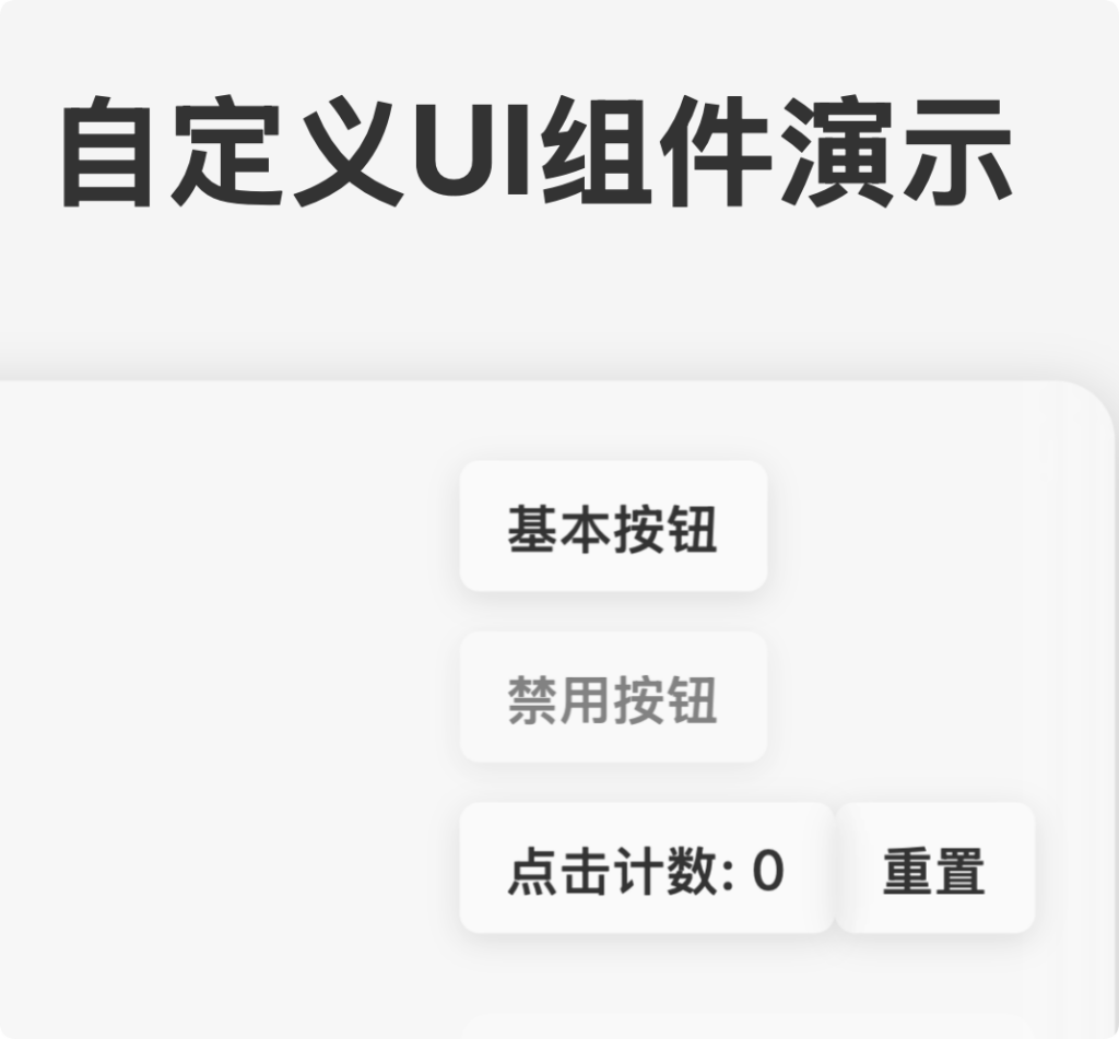
Custom-WebUI
这是一套基于 Web Components 实现的现代化 UI 组件库,具有响应式设计、多主题支持以及性能优化模式。组件采用原生 JavaScript 实现,无需额外依赖,可以轻松集成到任何 Web 项目中。
特点
- 原生支持 – 基于 Web Components 标准,无框架依赖
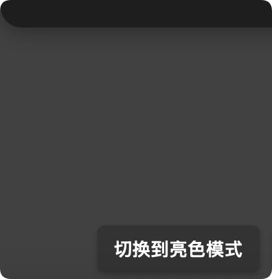
- 双主题模式 – 支持亮色和暗色两种主题
- 双性能模式 – 提供模糊特效模式和高性能模式
- 响应式设计 – 适配不同设备尺寸
- 可访问性 – 遵循 ARIA 标准,支持键盘导航
- 自定义样式 – 通过 CSS 自定义属性轻松定制
组件列表
当前提供的组件包括:
- Custom Button – 可定制的按钮组件
- Custom Card – 卡片容器组件
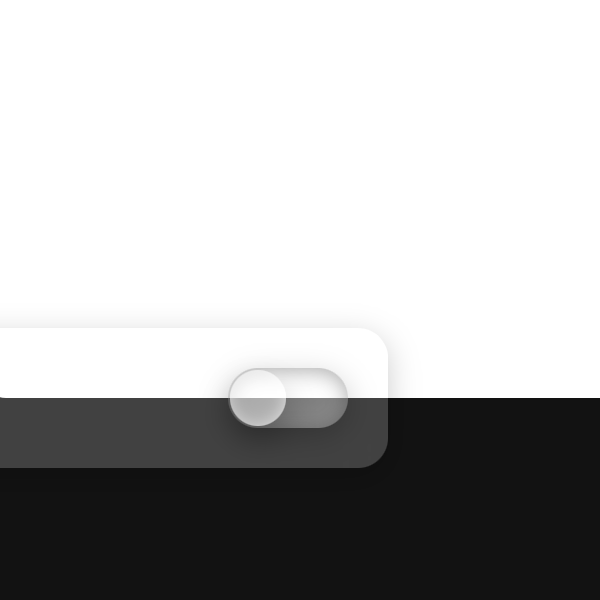
- Custom Switch – 开关切换组件
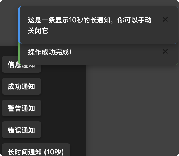
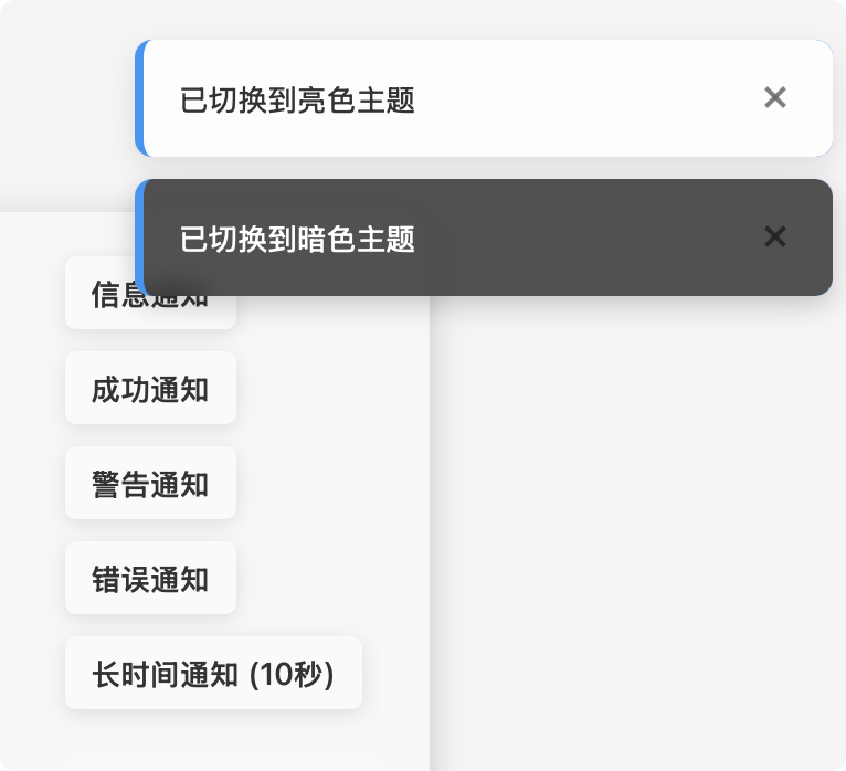
- Custom Notification – 通知提示组件
安装与使用
基本集成
将组件脚本引入到您的 HTML 文件中:
<script src="path/to/custom-button.js"></script>
<script src="path/to/custom-card.js"></script>
<script src="path/to/custom-switch.js"></script>
<script src="path/to/custom-notification.js"></script>
组件使用示例
Custom Button
<custom-button
  text="点击我"
  theme="light"
  variant="blur">
</custom-button>
Custom Card
<custom-card
  title="卡片标题"
  theme="light"
  variant="blur">
  <div>卡片内容放这里</div>
</custom-card>
Custom Switch
<custom-switch
  label="开启功能"
  theme="light"
  variant="blur">
</custom-switch>
Custom Notification
通知组件通常通过 JavaScript 动态创建:
// 显示一个通知
CustomNotification.show({
  message: "这是一条通知消息",
  type: "info", // info, success, warning, error
  theme: "light",
  variant: "blur",
  duration: 3000 // 显示时长,毫秒
});
详细 API 文档
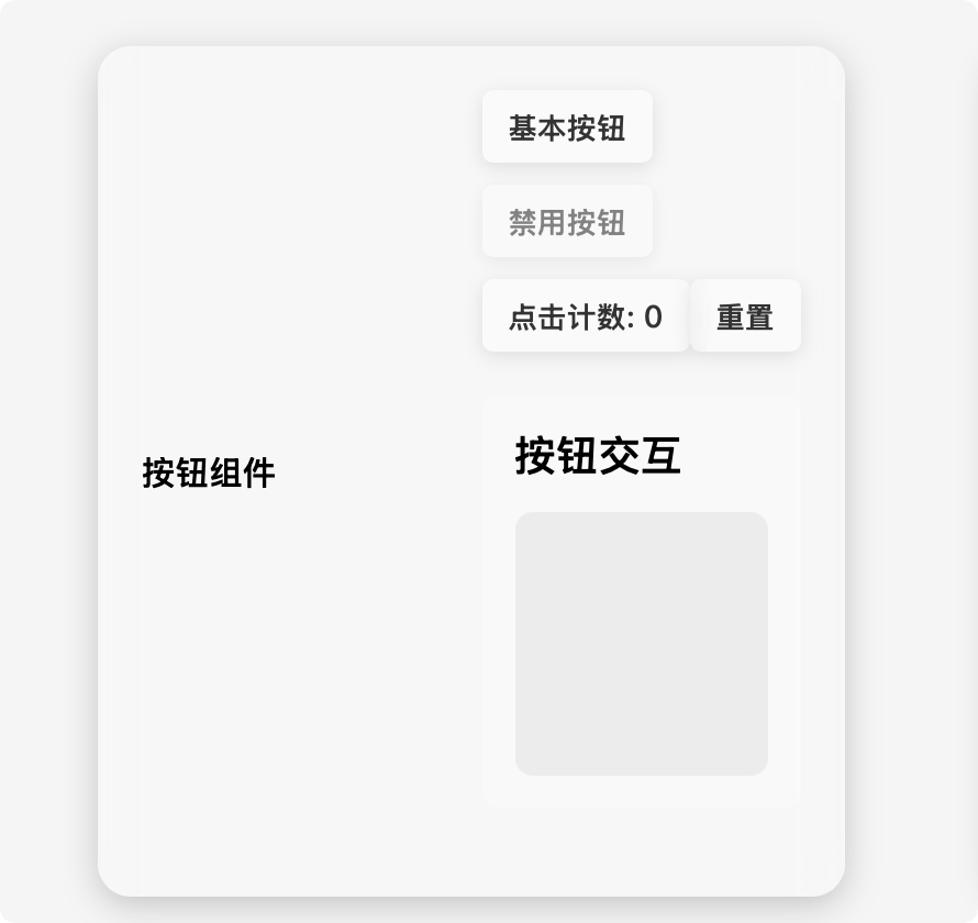
Custom Button
按钮组件提供用户交互的基本元素。
属性
| 属性名 | 类型 | 默认值 | 说明 |
|---|---|---|---|
| text | String | “Button” | 按钮显示的文本 |
| disabled | Boolean | false | 是否禁用按钮 |
| theme | String | “light” | 主题,可选值: “light”、”dark” |
| variant | String | “blur” | 显示模式,可选值: “blur”(模糊效果)、”performance”(高性能) |
事件
- click: 当按钮被点击时触发(如果未禁用)
示例
// 创建并配置按钮
const button = document.createElement('custom-button');
button.text = "提交表单";
button.addEventListener('click', () => {
  console.log('按钮被点击');
});

// 禁用按钮
button.disabled = true;

// 切换主题和变体
button.theme = "dark";
button.variant = "performance";
Custom Card
卡片组件用于内容分组和展示。
属性
| 属性名 | 类型 | 默认值 | 说明 |
|---|---|---|---|
| title | String | “卡片标题” | 卡片标题文本 |
| theme | String | “light” | 主题,可选值: “light”、”dark” |
| variant | String | “blur” | 显示模式,可选值: “blur”、”performance” |
插槽
- 默认插槽: 放置卡片内容
示例
// HTML中使用
document.body.innerHTML += `
  <custom-card title="数据统计" theme="dark" variant="blur">
    <div>这里是卡片内容</div>
  </custom-card>
`;

// 或通过JavaScript创建
const card = document.createElement('custom-card');
card.title = "用户信息";
card.appendChild(document.createElement('div')).textContent = "内容区域";
document.body.appendChild(card);
Custom Switch
开关组件用于切换状态。
属性
| 属性名 | 类型 | 默认值 | 说明 |
|---|---|---|---|
| checked | Boolean | false | 是否选中/开启 |
| label | String | “开关” | 开关标签文本 |
| disabled | Boolean | false | 是否禁用 |
| theme | String | “light” | 主题,可选值: “light”、”dark” |
| variant | String | “blur” | 显示模式,可选值: “blur”、”performance” |
事件
- change: 当开关状态改变时触发,事件详情包含
checked属性
示例
const switchElement = document.createElement('custom-switch');
switchElement.label = "启用通知";
switchElement.checked = true;

switchElement.addEventListener('change', (event) => {
  console.log(`开关状态: ${event.detail.checked ? '开启' : '关闭'}`);
});

// 监听状态变化
switchElement.addEventListener('change', (event) => {
  if (event.detail.checked) {
    console.log('功能已启用');
  } else {
    console.log('功能已禁用');
  }
});
Custom Notification
通知组件用于显示消息提示。
静态方法
CustomNotification.show(options)
显示一个通知,options 参数包含:
| 参数名 | 类型 | 默认值 | 说明 |
|---|---|---|---|
| message | String | “通知消息” | 通知显示的消息内容 |
| type | String | “info” | 消息类型,可选值: “info”、”success”、”warning”、”error” |
| duration | Number | 3000 | 显示时长(毫秒),设为0则不自动关闭 |
| theme | String | “light” | 主题,可选值: “light”、”dark” |
| variant | String | “blur” | 显示模式,可选值: “blur”、”performance” |
实例方法
- close(): 关闭通知
示例
// 显示一个成功通知
CustomNotification.show({
  message: "操作成功完成",
  type: "success",
  theme: "light",
  variant: "blur",
  duration: 3000
});

// 显示一个不会自动关闭的错误通知
const notification = CustomNotification.show({
  message: "发生错误,请检查网络连接",
  type: "error",
  theme: "dark",
  variant: "performance",
  duration: 0 // 设为0表示不自动关闭
});

// 稍后手动关闭通知
setTimeout(() => notification.close(), 5000);
全局主题和变体切换
您可以通过JavaScript全局切换所有组件的主题和变体:
// 切换到暗色主题
document.querySelectorAll('custom-button, custom-card, custom-switch').forEach(
  elem => elem.setAttribute('theme', 'dark')
);

// 切换到高性能模式
document.querySelectorAll('custom-button, custom-card, custom-switch').forEach(
  elem => elem.setAttribute('variant', 'performance')
);
性能优化提示
- 对于移动设备或低性能设备,推荐使用
variant="performance"禁用模糊效果 - 通知组件在多个通知同时显示时会自动管理位置,无需手动设置
浏览器兼容性
此组件库使用了现代Web标准,包括Web Components、Shadow DOM和CSS变量:
- Chrome 67+
- Firefox 63+
- Safari 10.1+
- Edge 79+